7. GRAPHS
7.1 INTRODUCTION
A graph is an accurate pictorial representation of data. The accuracy of data in physics requires that graphs be made on good quality graph paper. Nearly all graphs in physics are smooth line graphs; broken line (connect the dots) graphs and bar graphs are seldom appropriate.
The style and format of a graph will depend upon its intended purpose. Three types are common in physics:
1. PICTORIAL GRAPHS. These are the kind found in mathematics and physics textbooks. Their purpose is to simply and clearly illustrate a mathematical relation. No attempt is made to show data points or errors on such a graph.
2. DISPLAY GRAPHS. These present the data from an experiment. They are found in laboratory reports, research journals, and sometimes in textbooks. They show the data points as well as a smooth line representing the mathematical relation.
3. COMPUTATIONAL GRAPHS. These are drawn for the purpose of extracting a numerical result from the data. An example is the calculation of the slope of a straight line graph, or its intercepts.
7.2 ELEMENTS OF A GOOD GRAPH
Certain informational and stylistic features are required in all graphs:
1. The graph must have a descriptive title or caption, clearly stating what the graph illustrates.
2. Data points are plotted as small dots with a sharp pencil, or as pinpricks. Some method should be used to emphasize the location of the points, for example, a neat circle drawn around each point.
 |
| Fig 7.1. Good and bad choices of geometric slope of a graph. |
|---|
3. Curves drawn through the points should be smooth (use French curves if your hand is not steady). The curve should stand out clearly.
4. Choose scales that are convenient to plot and easy to read.
5. Choose scales such that the graph occupies most of the page. The two scales need not have the same size units. Also, the scales need not begin at zero.
6. Indicate the name, letter symbol and units of each variable plotted on each axis.
7. All text (title, labels, etc.) should be printed.
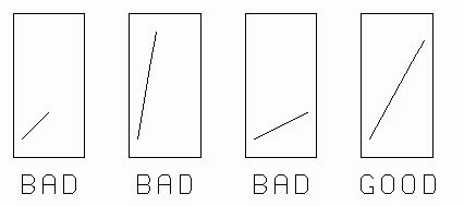
PHYSICAL SLOPE AND GEOMETRIC SLOPE
Slope. When textbooks refer to the "slope" of a plotted graph line we mean the "physical slope"
                 Δy
physical slope = ——
                 Δx
where Δy and Δx are expressed in the physical units of the x and y axes. This slope has physical significance in describing the physical data.
Geometric slope. A line which makes a 45° angle with an axis will not necessarily have a physical slope of size 1. Some authors introduce the term "geometric slope" to describe the tilt of the line on the page. This is a ratio of lengths of the legs of the triangle, without reference to the units plotted on the axes.
There is seldom (probably never) any need to calculate the geometric slope of a line on a graph. The idea is only useful when describing the appearance of the graph on the page. One rule of graph construction states that the graph should occupy most of the page. For square graph paper this suggests a geometric slope of 45°. See Fig 7-1 for examples of good and bad choices of geometric slope.
THE APPEARANCE OF THE GRAPH
 |
| Fig 7.2. Elements of a graph. |
|---|
Use quality graph paper, size 8.5 by 11 inches only.
The left margin is largest, for binding or stapling.
Nothing should be in the white margins except a page number. Axes, lettering and labeling should all be within the printed grid area. [The grid lines serve as guide lines for neat, uniform printed lettering.]
The title must be descriptive.
Both axes are labeled with the full name of the quantity (not merely its symbol), and its units.
The plotted points and curve should occupy most (more than half) of the area of the graph paper.
Sometimes a small sketch of the experimental situation may be included, located where it will not confuse the interpretation of the graph. In the same manner an equation, or short explanatory comment, may be included.
7.3 GRAPHICAL REPRESENTATION OF UNCERTAINTIES
Display graphs and computational graphs should clearly show the size of the experimental uncertainties (errors) in each plotted point. There are several conventional ways to do this, the commonest being the use of error bars illustrated below:
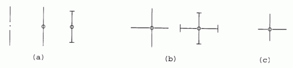 |
| Fig. 7.3. Various styles of error bars. |
|---|
The plotted point is represented as a dot, and the range of uncertainty is shown by the extent of the bars on either side. The types shown in (a) are suitable where the error is entirely in one variable, or where the errors in both variables have been lumped together. The types shown in (b) are preferred where it is necessary to show the error in each variable explicitly.
When the uncertainties have a symmetric distribution about the mean, the error bars extend equally on either side of the points. If the data distributions are not symmetric, the plotted points will not be centrally located in the range of uncertainty and the error bars might look like those in Fig. 7.3 (c).
Error bars may not be necessary when the data points are so numerous that their scatter is clearly shows the uncertainty. In these cases error bars would clutter the graph making it difficult to interpret. Another situation where error bars are inapprop- riate is when the scale of the graph is such that the bars would be very small. In this case, it may be possible to indicate the uncertainty by the size of the circle or rectangle surrounding each point.
7.4 CURVE FITTING
The curve drawn through plotted data need not pass exactly through every data point. But usually the curve should pass within the uncertainty range of each point, that is, within the error bars, if the bars represent limits of error.
One principle of curve fitting is also a fundamental rule of science itself:
We are not justified in assuming a more complex relation than can be demonstrated by the data. If a curve were drawn with detail smaller than the data uncertainty, that detail would be only a guess.
This rule of simplicity may also be expressed mathematically. The mathematical relations encountered in physics may often be represented by power series such as
| [7-1] |
y = A + Bx + Cx2 + Dx3 + Ex4 + ...
where A, B, C, ... are constants.
For very "wiggly" curves, many terms of this equation, including high powers of x, might be required to express the equation of the relation. The simplest relations are those which contain the smallest powers of x. The simplest relations of all are
| [7-2] |
y = a or y = a + bx
which describe straight lines. Many relations in physics are, fortunately, of this form. Others only include the x2 term, describing a parabolic curve. Note that double valued curves, sometimes encountered in physics, cannot be represented by Eq. (7-1).
When sizable amounts of data are taken, standard mathematical methods are available which generate the equation of the simplest curve which statistically "best fits" the data.
The student may wonder how one can be certain that the curve fitted to the data is the "correct" curve. The answer is that relations are never known with certainty. The uncertainty of available data always limits the certainty of the results. Someday someone may obtain more accurate data and be able to show that the old relations are slightly incorrect, and provide us with better ones. As data improves, so does our understanding of relations—this is the way of scientific progress. But we never should claim to know a relation better than the data allows.
7.5 UNCERTAINTY IN A SLOPE
One use of a computational graph is to determine the slope of a straight line. This is illustrated in Fig. 7.4. Eight data points are shown with error bars on each. If these bars represent maximum error, any line drawn to represent this data should pass within all bars.
If the error bars represent error estimates smaller than the maximum (average deviation, standard deviation, etc.), then the fitted curve need not pass within all of the error bars, just most of them.
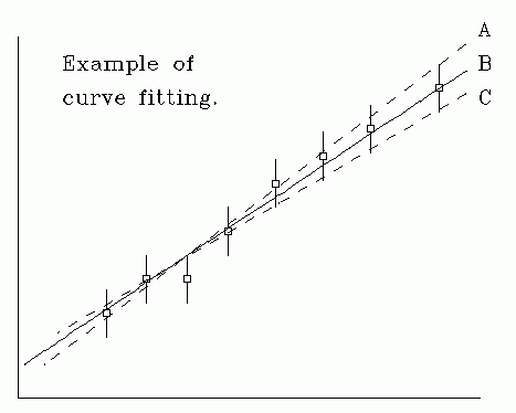 |
| Fig 7.4. Fitting a curve. |
|---|
Even a simple "manual" curve fit with a ruler can reveal the uncertainties in the slope resulting from uncertainties in the data. Fig. 7.4 illustrates this process.
The dotted lines A and C fall within the error bars, and represent the maximum and minimum slope one could justify from this data. The "best" value of slope might be that of solid line B.
The third point from the left seems to limit the slope the most, and would appear to be "suspect." But one ought not to "throw it out" without better reason, based on further investigation.
7.6 GRAPHICAL ANALYSIS OF DATA
Graphs can be a valuable tool for determining or verifying functional relations between variables. Many special types of graph paper are available for handling the most frequently encountered relations. You are probably already familiar with linear graph paper and polar coordinate paper.
You may have purchased a packet of graph paper for this course. It includes samples of graph papers you will use in this course, and a few other types. As you read the material below, examine the corresponding papers from your packet.
LINEAR RELATIONS are those which satisfy the equation
| [7-3] |
y = mx + b
where the variables are x and y, and m and b are constants. When y is plotted against x on ordinary Cartesian (linear) graph paper, the points fall on a straight line with slope m and a y-intercept b, as shown in Fig. 7.5.
The slope of an experimental relation is often physically significant. It is obtained by choosing two well-separated points on the line (x1, y1) and (x2, y2). From Eq. 7-3:
y1 = mx1 + b
| [7-4] |
and y2 = mx2 + b
Subtract the first from the second.
| [7-5] |
(y2 - y1) = m(x2 - x1) .
 |
| Fig 7.6. Measuring a slope on linear graph paper. |
|---|
Therefore,
| [7-6] |
         y -y
          2  1   Δy
     m = ————— = —— .
         x -x    Δx
          2  1
The slope of a straight line is a ratio of the "lengths" of two legs of a right triangle constructed with the legs parallel to the graph axes and with the graph line along the hypotenuse. Fig. 7.5 illustrates this, the slope being Δy/Δx.
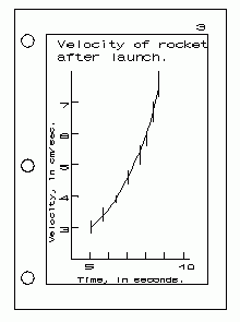
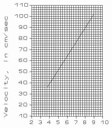
So far this discussion has been strictly mathematical. Now let's consider a fairly realistic physical example. Fig. 7.6 shows the curve from measurements of the velocity of a moving body as a function of time.
If we use letters v for velocity and t for time, we'd expect this curve to be described by the relation:
| [7-7] |
v = vo + at
Here the constant a (acceleration) is the slope of the line, while vo plays the role of b in Eq. 7-3. These two constants are physically significant, and we wish to find their values from the graph.
We choose two points on the line at t = 4.25 and 8.75, with corresponding values of velocity: 42 cm/s and 98 cm/s. Mark these points on Fig. 7.6, to confirm these values. The slope of the line is therefore:
| [7-8] |
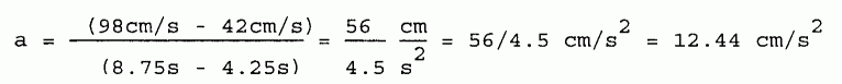
When calculating this ratio do not use ruler-measured lengths. The lengths are expressed in the units marked on the graph axes. The calculated slope is therefore independent of the particular choice of units, of the way you choose to label the graph scale divisions, and is also independent of the size of the graph paper.
INTERCEPTS: The values of the intercepts are often physically significant. They can be simply read from the graph—if the x = 0 and y = 0 axes happen to be within the graph's boundaries. In the equation y = mx + b, the y intercept is b.
The v intercept of Fig. 7.6 is the value of v when t = 0. It has the same units and dimensions as y. If, as in this case, the v intercept does not lie within the area of the graph, it may be calculated using the slope and one value taken from a point on the fitted line. Take the point v = 98 cm/s when t = 8.75 sec.
v = vo + at , in our case, v = vo + 12.44 t
so,
v = vo - 12.44 t = 98 - 12.44(8.75) = -10.89 cm/s
A check of the graph, Fig. 7.6, shows that this looks reasonable.
STRAIGHTENING A CURVE. When it is possible to convert an experimental relation to a straight line graph it is usually useful to do so. Look for such opportunities. For example, when studying gases at constant temperature we find that
| [7-9] |
PV = C
where P is pressure, V is the gas volume and C is constant. The graph of P vs. V is a branch of an hyperbola. But if we graph P vs. 1/V, or V vs. 1/P, the data would fall on a straight line.
| [7-10] |
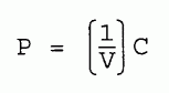
One reason for doing this is that it is easier to fit the experimental data with a ruler-drawn straight line, than to draw the best hyperbola on a PV graph. Another advantage is that the P vs. 1/V graph has a slope
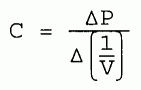
Therefore the constant C is easily determined from the straight line. This constant was not evident, nor was it easy to determine from the PV graph!
Inexpensive electronic calculators make it so easy to manipulate data that there is no good excuse to pass up an opportunity to "linearize" experimental graphs.
7.7 EXERCISES.
In each case state how you could plot (x,y) data on linear paper to obtain a straight line graph. What quantity in the equation is determinable from the slope of the straight line? What quantity is determinable from an intercept?
(7.1) x (y + 1) = 3
(7.2) 1/x + 1/y = 5
(7.3) y = A e-x
(7.4) y = √(A - x)
(7.5) y2 + x2 = 7
© 1999, 2004, by Donald E. Simanek.